The scaffolding came off this week and, with the newly renovated gables revealed, we could really start to see how the contestants’ houses are starting to take shape.
From the bricks and mortar of the houses’ exteriors (my personal favourite so far is Sticks & Wombat’s) our attention returned indoors, to the wonderful whimsy of The Block’s kids’ bedroom reveals.
Jason & Sarah
Jason and Sarah put up a kids room that was versatile in every sense of the word. Ageless and unisex, its adaptability is going to be very appealing to buyers, and that storage!!! If you’re a parent you know that kids have more folding clothes than hanging clothes and there was even room under the drawers to stow a toy box. Clever!
I had a love-hate relationship with Jason and Sarah’s lighting this week: I loved the pendant light in the centre of the room, the way it cast light and shadows on the ceiling was captivating, but the position of the bedside lamp right on the door architrave, and with an exposed globe, is not only impractical for a kid’s room, it’s an accident waiting to happen.”
On another positive note, I loved the wallpaper (and I’d love the name of their wallpaperer!) and the fact that this room accesses the en suite is going to be a great selling point. (Still no lock on the ensuite door though – grrrrrrrrr.)

Hannah & Clint
Hannah and Clint’s use of colour and pattern was outstanding this week – those pear trees really set a wonderful tone -– and the cushions and bedhead all help to create a cute, cosy kid’s haven. But this is where their decision to change the architect’s plan has brought them undone. The size of this former laundry room makes the bedroom feel like an afterthought, and pushing all the furniture to the periphery just highlights how small the space is.
The curtain blind is lovely, but it conceals a sliding door, which is not a practical thing to have in for a kid’s room (especially when you are dressing it for a young child) and it highlights how important it is to think ahead about the overall plan on The Block (and whenever you’re renovating a home).
With these departures they’re making from the architect’s plan, I hope they have a clear vision of where this renovation is heading. Otherwise it won’t matter how great their renovating and styling talents are, their house is going to lack cohesion.

Ronnie & Georgia
Sugar and spice and all things nice… this week Ronnie and Georgia created a bedroom childhood memories are made of. From the beautiful joinery, to the whimsical bed canopy, complete with fairy lights, to the wallpaper on the ceiling, this bedroom captures the essence of childhood and I can imagine there are going to be a lot of little girls insisting their parents buy Ronnie and Georgia’s house on inspection day.
And what’s not for parents to love? Ronnie and Georgia have given mum and dad somewhere to sit to read to their kids, or supervise their morning get-up routine, and the storage has been designed to accommodate all those folding clothes, with some out-of-reach shelves for precious items.
The magic of Ronnie and Georgia’s room gave me goose bumps – it is like a warm hug that transports you back to your own childhood. The only slight flaw in my eyes was the exposed light bulb, which, as I’ve already mentioned, is not practical in a child’s room. Other than that, this is one of the best kid’s rooms I’ve ever seen!

Sticks & Wombat
Another adventurous, confident, and insanely good room by The Block’s surprise package, Sticks and Wombat, this week.
The scale of the room and the Velux sky light in the ceiling was breath taking, and potential buyers aren’t going to forget that climbing wall in a hurry. I loved the wallpaper pattern – it really helped to soften the room – it’s just a shame it was applied so badly (and so bubbly)!
The boys’ storage didn’t work for me. The wardrobes and big toy drawers in the bunks got a big tick, but where are the clothing drawers??? There is hardly enough wardrobe space for one child, let alone two, and a two-way light switch would also have been a practical addition to the bunk beds.
Sticks and Wombat bring so much fun and energy to their rooms, but they may need to tone that down to meet market expectations once they get to some of the family areas like the kitchen and living room.

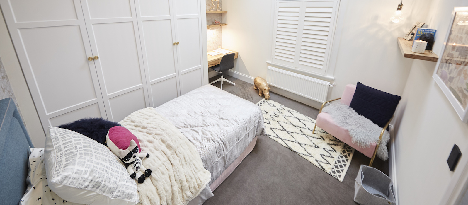
Josh & Elyse
Josh and Elyse set themselves apart this week by giving us a teenager’s retreat rather than a kid’s bedroom. The couple’s planning abilities have created a little self-contained apartment with great bones, and I loved the soft colour palate of some of the styling elements, but the predominance of white in the walls, lack of a visual focal point to grab you, and the blending of the colour of the shutters, makes the room ‘vanilla’ and lacking in emotion.
I felt the absence of the home’s heritage elements keenly, especially after the couple did so much to play those elements up in last week’s room.
The skylight and stairs were the only nods to drama in Josh and Elyse’s room this week, but even then it didn’t feel like it added a lot to the room, as the space upstairs was small, wasn’t comfortable, and took a lot of effort for minimal gain. Sadly, their underwhelming styling meant the overall effect was bland, lacked charm, and missed the mark impact-wise as a result.
Which was your favourite of this week’s kid’s rooms and why? Tweet me or post on Instagram tagging me @ShaynnaBlaze, or leave a comment on my Facebook page.
Megan Dougherty
Bravo Management Pty Ltd
Level 5, 111 Coventry Street,
Southbank VIC 3006
P: +61 (3) 8825 6641 (direct)
Blank Canvas Interiors
598-600, Burwood Road
Hawthorn East, VIC AUSTRALIA 3123