It is hard to walk into the lounge and not be hit between the eyes by the Taubmans Plumb Ruffle colours on the walls.
Why so daring? This family has got a lot of personality. The deep purple colour matched their personality and their energy. Plus – Andrew and Tamara had challenged me to put excitement into their home and I love to take people out of their comfort zones and show them something completely different from what they had envisaged.
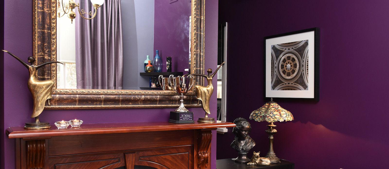
Why so dark? Integrating a dark colour on the wall highlights architectural features like cornicing and stained glass windows. It also enhances the coziness of a space and gives the illusion of a warm embrace.
The dark timber in the mantel piece is a beautiful feature. By utilising a colour that matched its strength, the fireplace was made to feel bigger and the small room, wider. Additionally, the wine-coloured leather on the couch links with the wall. By using two strong colours so closely together, they connect and visually lengthen the sense of space they are working in.
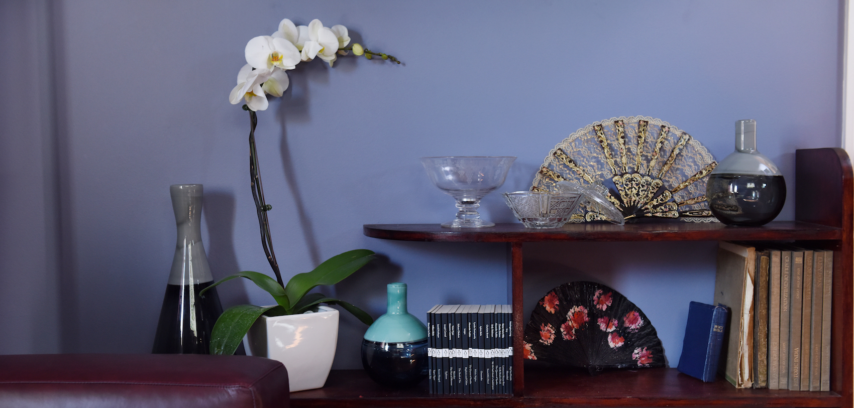
To lighten the depth of the Plumb Ruffle colour, I used Taubmans Violet Verbena (it’s actually Taubmans colour of the year for 2017!) Taubmans on the opposite wall. This lighter shade of purple is still in the same palette, it just softens the heaviness of the main colour, whilst adding to the cohesion of the environment.
Taubmans
Facebook
Instagram @taubmans
Images: Vanessa Hall, Lifestyl
Megan Dougherty
Bravo Management Pty Ltd
Level 5, 111 Coventry Street,
Southbank VIC 3006
P: +61 (3) 8825 6641 (direct)
Blank Canvas Interiors
598-600, Burwood Road
Hawthorn East, VIC AUSTRALIA 3123